In a recent post, we outlined how and why brand guidelines are critical to maintaining a strong and healthy brand. Here's an excerpt:
"The primary purpose of brand guidelines is to ensure that your brand's visual and verbal elements are used consistently across all marketing and communication channels, both internally and externally. Your brand guidelines are an essential tool for maintaining brand integrity and creating a solid and recognizable brand in the eyes of customers. This will create a more memorable and impactful presence in the market.”
Each brand is unique. Companies need to adapt their brand guidelines to match their brand's values, personality, and goals. Tailoring guidelines ensures that they align with the brand's identity. They don't include only visuals; they also cover tone of voice, messaging, and emotional connection. These things help your brand connect with your audience. A well-crafted set of brand guidelines serves as a roadmap for maintaining a consistent and memorable brand identity.
For companies that sell many different products and operate in multiple regions, brand guidelines are very important. They help maintain consistency across the company. In this blog, you'll find five real-life examples of brand guidelines to inspire your brand-building efforts. These examples are all leaders in their sectors, partly due to their commitment to maintaining the integrity of their brand. Let's get started.
Mailchimp
Mailchimp's brand guidelines are not only visually appealing but also highly informative. They provide examples, templates, and best practices for using their logo, Freddy the mascot, and other brand elements, making it easy for users to create on-brand content. It answers questions users may have about crucial brand assets like the company name, Freddy, and colors. The FAQs also highlight why it is vital to maintain brand consistency. And it's all done in Mailchimp's signature cheeky brand tone, which is also very informative. This simple web page is easy to read and use, with art files available for download. This is a master class in concise, efficient, yet useful brand guidelines.
Buffer
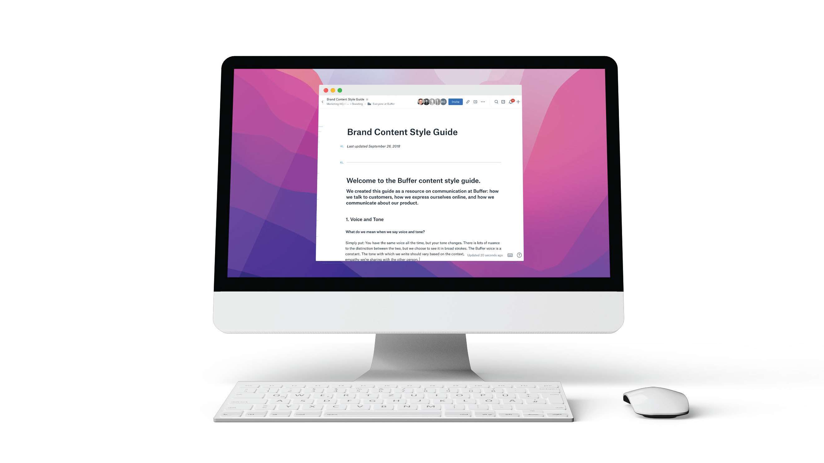
Brand Guidelines are not only about logos, colors and visuals. Take Buffer, for example. Buffer is a social media management platform that helps clients schedule and publish content, engage with their audience, and analyze social media performance. As such, Buffer created style guidelines around content, or the words that embody their brand. Buffer's content style guidelines clearly explain voice, tone, personality, and even the company's email marketing philosophy. This detail makes it easy for anyone to understand and apply the Buffer brand consistently through content. The guidelines are also a great example of transparency, including brand rules around diversity and inclusion, highlighted by this guiding principle: "If it's not relevant to the story you're telling, it doesn't need to be said."

Slack
Slack's brand guidelines are comprehensive. This 50-page document starts with their mission, vision, brand values, and persona, which offers users a complete overview of the company's culture. The guidelines then detail Slack's voice and tone, offering examples to highlight the essential details. For example, Slack's voice is "confident (never cocky) and witty (but never silly) ." The next part illustrates the brand's visual identity, showing how to use logos, color palettes, fonts, illustrations, photography, video, and more. A governance section outlines Slack's trademarks and other use requirements. The result is user-centric and flexible. Slack's guidelines offer multiple messaging and design variations and encourage creativity within certain boundaries, allowing users to express the brand in their unique way while maintaining consistency.

Apple
Apple has two online brand guidelines. One is a style guide that provides "editorial guidelines for text in Apple instructional materials, technical documentation, reference information, training programs, and user interfaces. The intent of these guidelines is to help maintain a consistent voice in Apple materials." This style guide includes tips for writing inclusively, how to write common abbreviations, when to use product names as verbs (i.e., AirDrop/AirPlay), and more. This guide does not have much direction about personality, voice, and tone. Yet, the editorial rules are so comprehensive that it's easy to glean Apple's brand voice from them.

The other document is Identity Guidelines, which outlines how to use Apple's signatures, logos, and other graphical elements. These guidelines are expressly for retail affiliates and resellers. Apple is known for its minimalist, clean, and sleek design. The visual guidelines reflect these principles. From the proper use of white space to maintaining consistent typography and color schemes, Apple's guidelines ensure a cohesive brand image across all touchpoints. These touchpoints include partner store displays and signage, social media, apparel, vehicles, and more.
Adobe
Adobe's brand guidelines are for developers who use Adobe APIs and software development kits to create custom software solutions, plugins, or integrations that enhance the functionality of Adobe products. They outline the proper use of Adobe trademarks, names, logos, icons, and badges on websites and other marketing. There are specific download and review rules for Adobe assets. The document also provides editorial guidelines for each Adobe product name.
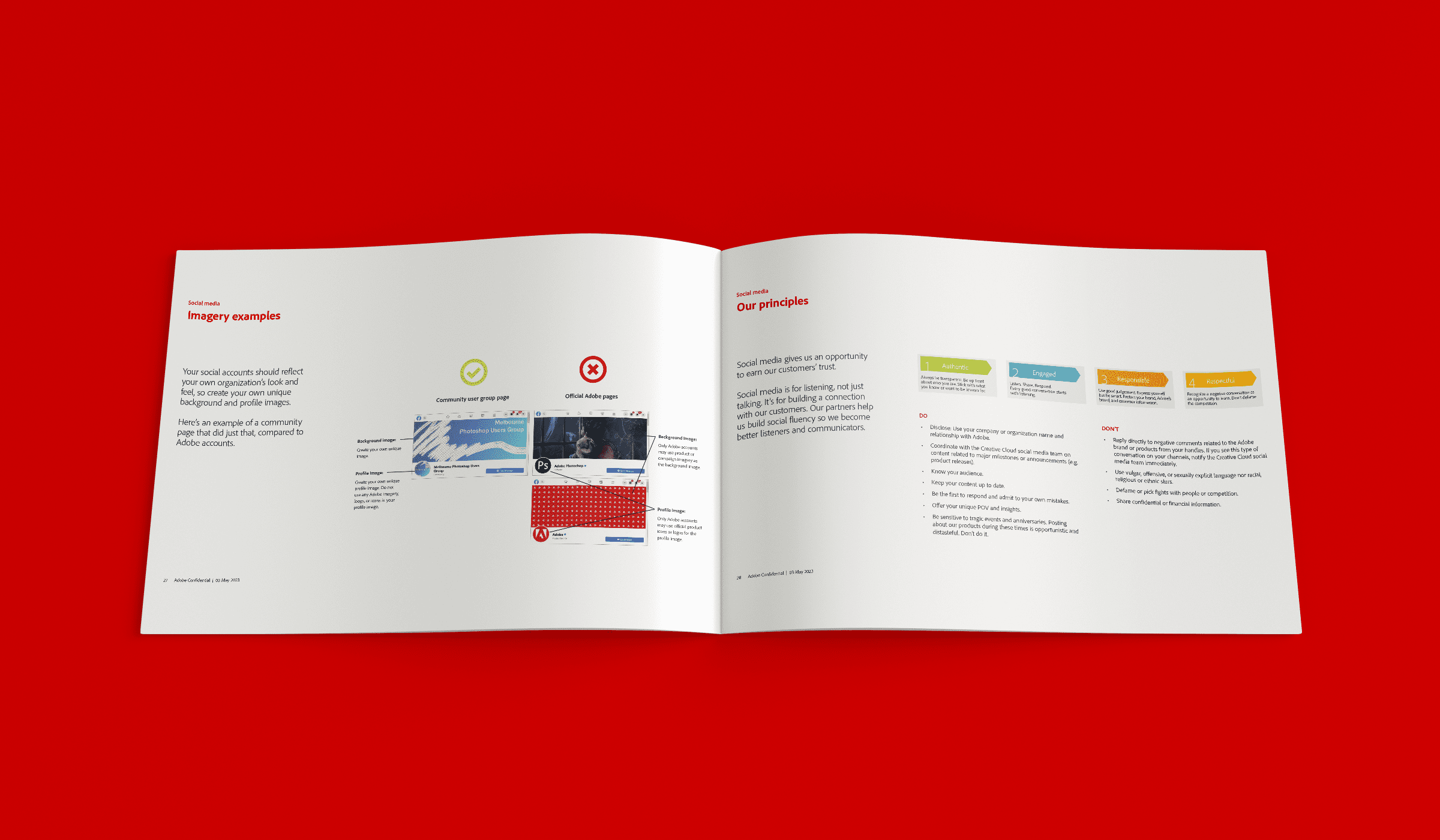
Most interestingly, the brand book also shows how to use the Adobe brand in social media. Adobe has a very succinct point of view on social media. "Social media is for listening, not just talking. It's for building a connection with our customers. Our partners help us build social fluency, so we become better listeners and communicators." Overall, Adobe's brand guidelines provide a scalable system that allows creativity while ensuring the brand's core identity remains intact.

Your Brand Guidelines
The examples in this post demonstrate how some iconic brands leverage brand guidelines to achieve enduring success. By studying these examples, you can create guidelines to begin your journey toward brand awareness and long-lasting success.
Phase 3's brand strategy team can help you create, manage, and evolve your brand. Plus, after completing your brand framework, we can safeguard it by storing all assets on Media:Link. Media:Link is a handy platform for authorized employees and partners to access resources as needed. This ensures that your brand guidelines are followed and that your assets are used correctly. Contact us today if you need a partner in building and protecting your brand guidelines.